My web serial, Worth the Candle, has been adapted into a webcomic. This was thanks to my agent, who I have a great fondness for, since without him I would have to spend time trying to make connections and call people and do a bunch of work that I don’t know how to do and am not good at.
I was offered the chance to write the webcomic, but declined, mostly because writing Worth the Candle had taken four years and was pretty draining, and was a story that I feel like I’m done with, minus some editorial stuff, answering fan questions, and the odd bit of promotion. So my level of involvement is that I get the pages as they come in, make some comments on them, and generally just give feedback which they are free to ignore.
So let’s talk about some of the adaptational changes! You can read the first three issues on Webtoon here, or the first eight issues if you’re willing to pay, and the books start here, but I’ll assume that you haven’t read either, and there won’t be substantial spoilers because I’m talking about stuff from the very beginning. Actually, I guess there will be some spoilers, but later on, and I’ll mark them, mostly having to do with some foreshadowing that the webcomic does which I didn’t do.
(I licensed the rights to make the webcomic to WebToon and took my payment upfront, they didn’t ask me to write this post, I have not actually asked the artist/writer why they made these changes, it’s just me guessing and commenting, for fun.
Edit: My agent has informed me that I’m mistaken, I do get a cut. So apologies for the misinformation, and hooray for me, I guess I signed the contract ages ago and just forgot the details.)
Character Design
Here’s how Juniper Smith is described in the books, ch 2:
I won’t belabor my physical description. My friend Greg had once said that I looked like someone had chosen ‘default’ for every option in the character creator, which I’d tried to laugh at but cut kind of deep. I wasn’t handsome, I wasn’t ugly, none of my features were very prominent, my eyes were blue, my hair was brown, average build, average height … After Greg had made his comment at one of our D&D games, my nickname had been ‘default’ for a while, at least until I stopped pretending to find it funny, and even after that my friends would use similar lines to trash talk me, saying that I was “the most generic man alive”, “a white bread with skim milk motherfucker”, or “the human equivalent of vanilla ice cream”. Not that I was any less of an asshole to them.
This is how he looks in the comic:
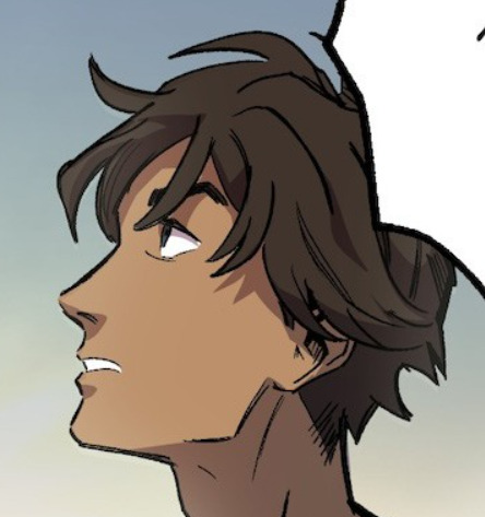
I would more or less give this full marks.
In terms of other aspects of character design, Juniper is here given a black shirt with a red symbol on it rather than the stock white t-shirt he’s wearing in the opening chapters of the first book, probably in the interests of adding in some visual variety. On the page, it’s perfectly fine that every person in the first 50k words is wearing basically the same stock outfit. In a visual medium, I do think that you need that pop. I do think it’s interesting that Juniper is wearing the same clothes in the classroom as he is on the plane, implying that when he transmigrated his clothes … came with him? I don’t know.
The other major character of the first section is Amaryllis, who is a major character in the entire work. Here’s her description in the book:
Standing by a workbench, among various car parts, tools, and cans of unidentified fluids, was the most beautiful girl I had ever seen.
I’m not really sure what protocol is here, in terms of prose. I mean, I don’t want to sound like a creep, so maybe I should stay as generic as possible and tell you about her dark red hair pulled back in a braid, the glacial blue of her eyes, how starkly alert she looked as she peered over the parts in front of her, or her grease-smeared clothes. Save for her eyes, I wasn’t really focused on any of that. My mind was consumed by tracing her curves, the shape of her chest in her blood-stained t-shirt, the fullness of her lips and the delicate way she had them parted — and yeah, it was pretty fucked up that the splatter of blood on her shirt wasn’t worth rating much of a mention. I was consumed with staring at her and thinking how gorgeous she was, until I noticed that she was having a powerful effect on me, at which point different parts of my mind were given over to marveling at the sensation of being so attracted to a girl, and others were still focused on her.
Imagine that someone spent a few years studying your likes and dislikes, running through video of your every private moment, somehow surreptitiously hooking up EKGs to measure your physiological responses without you knowing. Then imagine that they sat down with that data and the best photo manipulation artists in the world and made the absolute perfect picture to cause your heart rate to spike, a jolt to run up your spine, butterflies in your stomach, and a cold sweat on your palms. Then imagine that they did this again, over and over in slight variations, until they had a full 4K 60fps 3D movie to show you. That was what it was like watching her.
And here she is (as she’s introduced) in the comic:
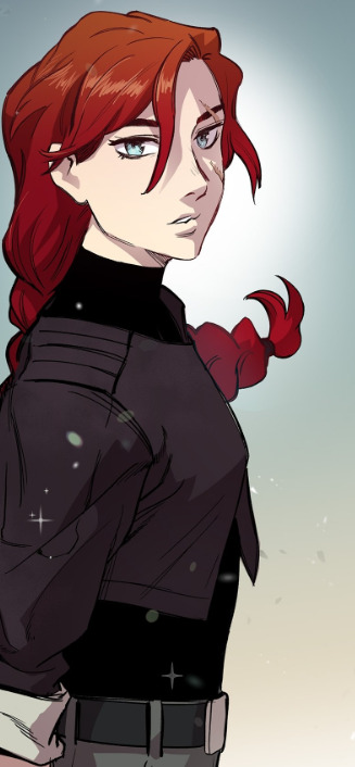
Aside from the change in clothes, which in the book are the same white t-shirt and blue jeans that everyone else is wearing, Amaryllis has a scar on her face, of unknown provenance. This was probably added for visual variety, but I do find scars to be very fetching, and in one of the early versions of Worth the Candle she did have one (patterned off a woman with an extremely attractive facial scar I had met, the kind of facial scar that looked like it was applied by a Hollywood makeup artist specifically to give a touch of the exotic and mysterious, except she was a just a Midwestern mom).
And of course Amaryllis was always going to be an adaptational challenge, because the books are told through Juniper’s eyes, and she’s The Most Beautiful Girl in the World to him, and conventionally attractive to everyone else. Juniper tries to be normal about this. But if you’re in the visual medium, you have to show both how Juniper feels and how she actually looks, and attractiveness is just so incredibly personal. My wife and I get in these kinds of discussions a lot, where she’ll think someone is good-looking and I’ll say “him?” or vice versa.
I think the above panel in particular is a good middle ground, a glamour shot that snaps back to the reality of their first meeting:
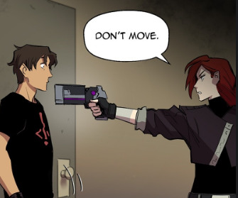
(The void gun she’s holding there is much different from the one described in the book, not something cobbled together from spare parts and void equipment, but this is another very minor change that I would assume is meant for communicating immediately that this is a lethal weapon, and there’s probably not a place for explaining how and from what it was cobbled together, which is also under-explained in the book for reasons of pacing.)
Story
I’ve read the first nine episodes, and overall, it’s hewing very closely. There are a few bits in particular that stand out to me in how they’re handled.
Spoilers for later in the series follow, I guess.
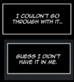
These are the opening lines of the webcomic. This is much stronger foreshadowing than I used, and I like it. Part of Juniper’s backstory is that he’s been deeply depressed and self-destructive, and he’s slow to open up about this with other characters or the reader. The “it” that he couldn’t go through with is, then, suicide. In the books? This comes very very late. Juniper being depressed after Arthur’s death is brought up after the first major arc, halfway through what’s now Book 1, and gets more explicit as the books go on, eventually getting to Juniper talking about his attempted suicide with people and grappling with it like … almost halfway through?
I don’t know what the plans for the webcomic are, but my guess is that they’re setting up for much, much later on in a way that I didn’t. This was always a background element, something that informed Juniper’s character, not so much the suicide attempt as the feeling that came after, this understanding that yes, he did want to live, a heady, energizing kind of “I guess I don’t have the way out that I thought I did” sort of thing.
So I take it as a good sign that this is the opening line. It points toward them understanding where they’re going.
One of the other major adaptational changes is that they signpost Arthur’s death with a memorial on his desk:
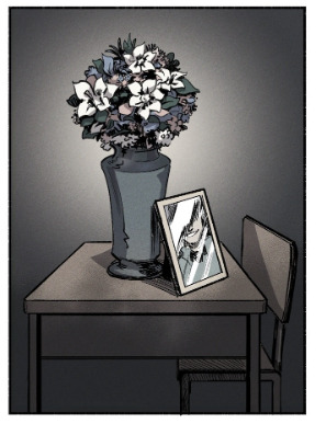
When I was getting pages, this was one of the first moments where I was like “yes, this is a good change, visual storytelling to replace my walls of text, flows and offers indirect information”. I am very happy with the adaptation thus far, and stuff like this is what I love about adaptation in general, the need to grapple with the strengths and weaknesses of the medium.
Content Rating
Worth the Candle gets grim and dark in places. It at least attempts to grapple with serious things. The webcomic is rated Young Adult, and I’m not sure how they’re going to handle the later stuff, but I can talk about how they’re handling the stuff now, and what I think it means overall.
First, there’s a lot less swearing. Worth the Candle in its entirety uses the word “fuck” ~1200 times. Granted, this is over the course of 1.6 million words, so a fuck density of one every 1.3k words, and some of those are in the verb “soulfuck” rather used descriptively, as exclamations, etc. My personal feeling is that this doesn’t matter basically at all. I don’t think I notice when someone isn’t swearing unless they’re using corny substitutions or trying to get cute with it.
Second, the violence is toned down in that YA way, where they’re still showing much of the same things, just not with the same level of visceral detail. When a Marvel comic has someone thrown into a wall, they’re no blood or snapping of bones or mangling of bodies, at least if it’s a comic at a certain rating (I have definitely read some edgy 90s comics that do go hard on the violence). I think, overall, that this isn’t my preference, which might be obvious from the way that I try to write fight scenes and such. But I’m also sort of inured to this toning down of violence, since it’s omnipresent.
Third, there’s the sex stuff, and … well, it hasn’t come up in the webcomic yet. I think I laid out my reasoning for why I think sex scenes should be written/included in Why to Write a Sex Scene, but the brief version is that sometimes you’re showing how characters relate to each other, what they think of each other, and the sex scene shouldn’t always just be something that’s skipped over and left to the reader’s imagination, because things happen, there are moments of communication, it can and does develop a relationship in the moment rather than after the fact. Plus a little titillation is, in my opinion, usually good.
The great thing about writing webfic is that no one can stop you from just including three solid chapters of hardcore pornography in the middle of your story. I have never done that, but I could is the point, and I would only get complaints from people who have no power over me. That same freedom doesn’t exist here, and … yeah, it makes my heart sink a little bit.
Fourth, there’s some of the more mature content stuff, the topics that might not be broached. I don’t know how they’re handling that, so I reserve judgment, but I think my opinion is probably going to be “well, you do what you have to do”, and if my version of the story is superior because there are no brakes, then I can be smugly superior about that.
Conclusion
This is already a fairly long post, and there are a few other things that I could have remarked on, but I think this is all the most interesting stuff.
Alright, just one real quick: Arthur is adaptationally more attractive, though this is also how Juniper sees Arthur and I think by the standards of webcomics, this is actually sort of necessary. Most of the flashback cast is not described until much later on, and by then you kind of know and understand them from the things they’ve said, if you can keep track of them. Many of the flashbacks are nearly disembodied. But if you’re showing Arthur early, then the first impression he’s going to make is in his appearance, and that really anchors people.
So overall, I am happy with the adaptation. There are challenges ahead, and I’m thankful that I’m not the one who needs to tackle those challenges.
If you have found a spelling error, please, notify us by selecting that text and pressing Ctrl+Enter.
One thought on “Adaptational Changes for the Worth the Candle webcomic”
I was pleasantly surprised to see WTC show up on my Webtoons feed and I read it immediately. Implementation looks decent so far.